WORK // BRANDING // Parade of Friends by Love Does
I'm thrilled to share the logo developed for Parade of Friends, the recurring donor program by Love Does. This initiative invites supporters to be part of something bigger—an ongoing movement of generosity, hope, and transformation.
The creative ask was to craft a visual identity that captures the heart of the program while aligning with Love Does’ vibrant spirit. From whimsical charm to meaningful symbolism, each concept was designed to reflect a sense of community, joy, and lasting impact.
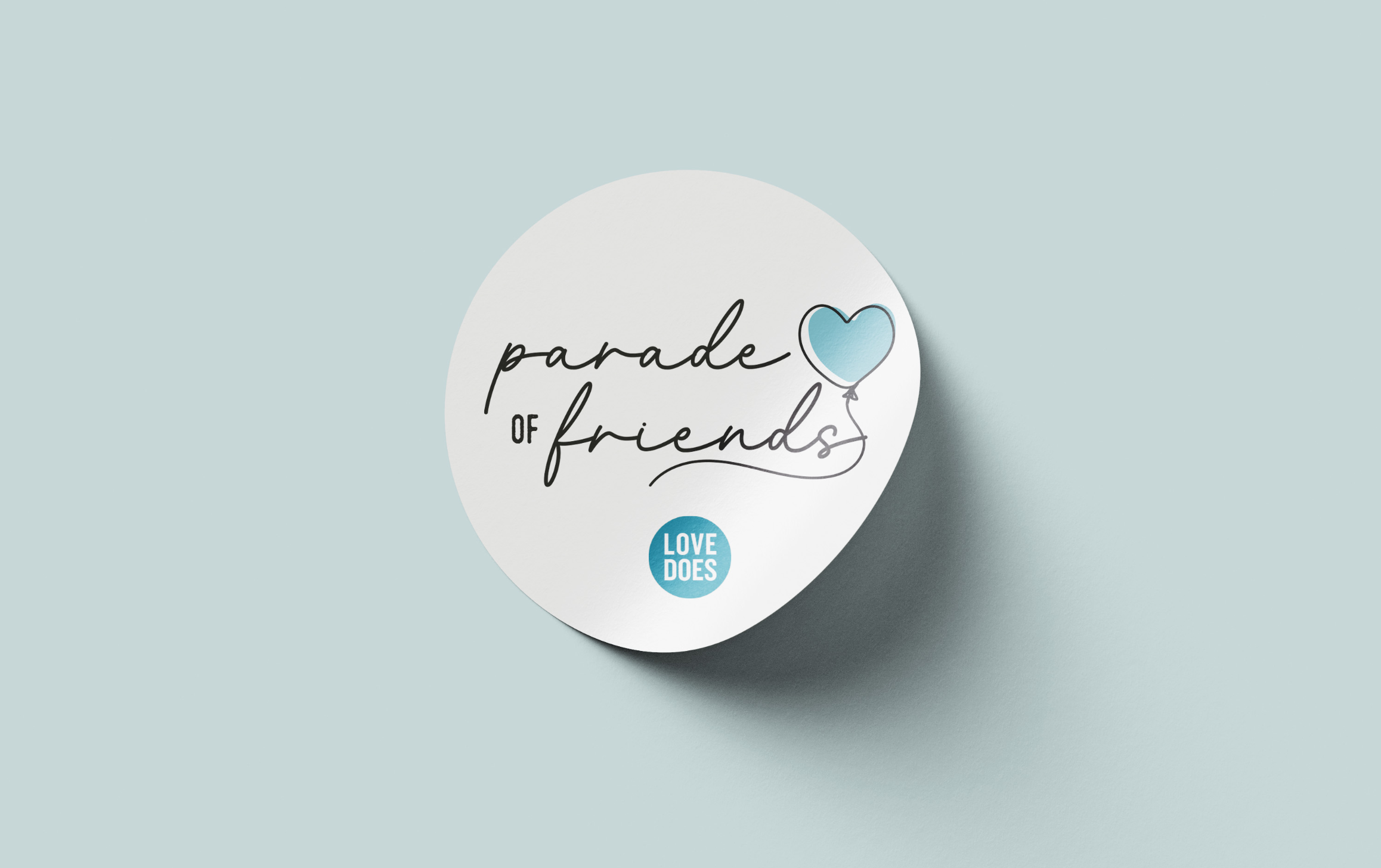
This logo features a cursive font that exudes warmth and charm, almost like handwriting, creating an inviting, homey feel. The organic, flowing letterforms add a personal touch, evoking comfort and authenticity. Complementing the text is a delicate, hand-drawn heart-shaped balloon—a subtle nod to whimsy and lighthearted joy. The combination of these elements strikes a perfect balance between playfulness and elegance, making the design both endearing and memorable.
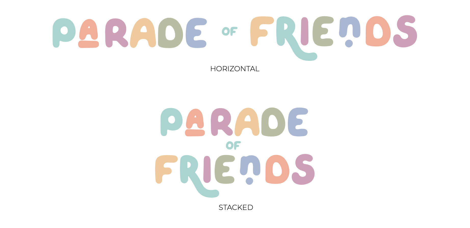
Alt. Concept Presented
This logo features a custom-designed font with playful, rounded letterforms that subtly echo the curves and twists of balloon animals. The color palette is warm and inviting, using soft yet vibrant hues that convey friendliness without overwhelming the design. While the shapes nod to whimsy, the overall composition maintains a refined balance, ensuring a polished and professional feel. This blend of fun and sophistication makes the logo approachable yet stylish.


