WORK // UI/UX // Linqto Purchase Flow Optimizations
We set out to redesign Linqto’s purchase flow—one of the most critical and sensitive parts of the investor experience. While the platform made it possible for accredited investors to access shares in pre-IPO companies, the existing flow was outdated, confusing, and especially challenging on mobile. High drop-off rates and recurring user feedback revealed friction at key moments, including accreditation verification, payment processing, and document signing. By focusing specifically on this flow, we aimed to reduce friction, increase conversion, and create a smoother, more trustworthy path to investment.
The creative ask was to redesign the purchase flow to reduce friction, increase conversions, and ensure legal compliance—all while modernizing the experience for a sophisticated investor base.
THE PROBLEM
The current purchase flow has a significant drop-off rate, with only 32% of users completing their orders after initiating the process. This indicates a need to redesign these pages to enhance user experience, reduce abandonment, and make them scalable for future features.
Data Methodology for Graph: Conversion data is measured uniquely per user, company, and day—tracking progress from order started to order review confirmation to order completed. The graph specifically displays the ratio of orders completed to orders started.
Note: Users may visit the order review page multiple times, which can inflate the confirmation counts. In recent data, we’ve observed more review confirmations than order starts, likely due to repeat visits or page refreshes.

SUCCESS METRICS
Primary KPI: Purchase Started → Order Completed conversion
Secondary KPI: Avg $ amount per investment
Additional KPIs measured:
Order Confirmation Page View → Additional Order(s) Completed (in the Same Session)
Order Confirmation Page View → Additional Company Pages Viewed (in the Same Session)
DESIGN PROCESS
Problem Definition & Goals
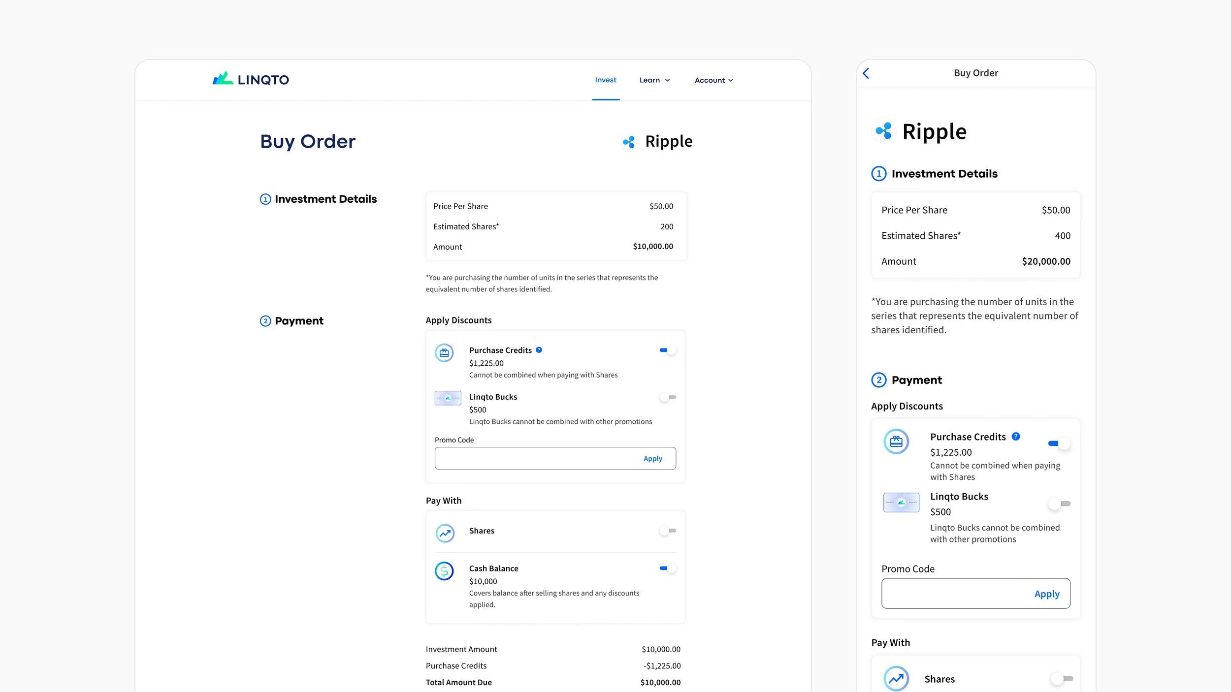
The objective was to simplify the Order Details Page UI to reduce choice overload and improve conversion from Order Started to Order Completed. Our hypothesis was that the existing interface, with its many nested sections, was overwhelming users and creating unnecessary friction in the purchase flow. The primary goals were to increase conversion rates, lower bounce rates, and create a more intuitive experience—particularly for users on mobile devices.
Research & Discovery
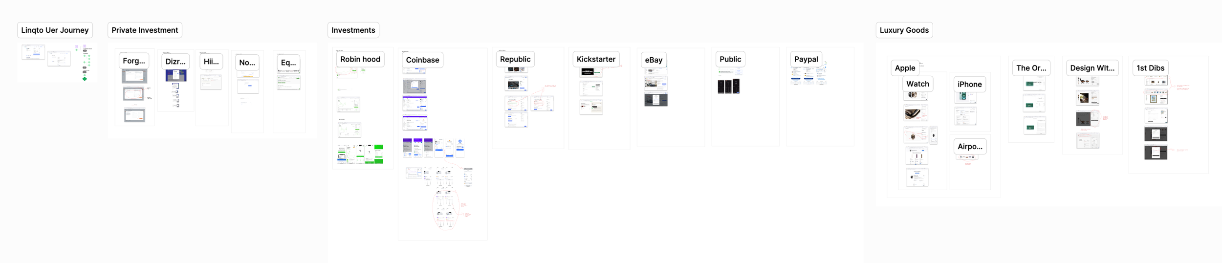
Our research approach combined multiple inputs to ensure a well-rounded understanding of the problem. We analyzed user behavior data—such as click patterns and drop-off rates—and conducted surveys and interviews to uncover key pain points. A competitive analysis helped us identify best practices and opportunities for differentiation by examining how other platforms handle similar pages. Additionally, we gathered insights from internal stakeholders across Product, Marketing, and Customer Support to better understand the page’s current performance and user concerns
As part of the research phase, we conducted a competitive analysis of investment and fintech platforms like Robinhood, Coinbase, and Public to understand how they guide users through high-stakes purchase flows. This helped identify common patterns—such as progress indicators, simplified legal disclosures, and in-line help—that build trust and reduce friction during complex financial transactions..
Ideation & Concept Development
During the ideation phase, we collaborated as a team to brainstorm ways to simplify the UI—exploring options like reducing visual clutter, consolidating information, and reordering content for better flow. We created low-fidelity wireframes to test these layout changes with a focus on minimizing cognitive load and improving usability. In parallel, we mapped out detailed user flows to understand the full journey from landing on the Order Details Page to completing a purchase, identifying key decision points and areas of potential friction.

Prototyping & Design Iteration
We built mid- to high-fidelity prototypes of the simplified UI to test visual hierarchy, interactivity, and overall user flow. These prototypes were then used to create an A/B test, comparing the new design (Variant) against the existing interface (Control), with a focus on key conversion metrics. Before launching the experiment, we conducted both internal and external usability testing sessions to catch any friction points and refine the experience further.
Experimentation & Evaluation
We launched the A/B test by directing traffic evenly between the control (existing UI) and the variant (simplified UI) to evaluate performance differences. Success was primarily measured by the conversion rate from Order Started to Order Completed, alongside secondary metrics like bounce rates and time on page. After the test, we gathered qualitative feedback from users to better understand their experiences with the new design and to uncover any remaining pain points or areas for improvement.
We ran a 5-week experiment to over-simplify the purchase flow, hypothesizing that reducing choice overload would improve conversion. The control outperformed the simplified variant, with a 28% conversion rate (order started to completed) versus 25% with a 50/50 traffic split.

Takeaways: The simplified UI didn’t significantly improve conversions, indicating that choice overload wasn’t the main issue. Factors like page content, user decisions, and layout all play a role.
Post-Test Analysis & Insights
After the A/B test concluded, we analyzed the results to determine which version led to higher conversion rates and to uncover patterns in user behavior, including the impact of external factors like the introduction of self-accreditation. We evaluated whether the simplified UI effectively reduced choice overload and whether the content structure improved user engagement. Based on these insights, we identified opportunities for iteration and explored the potential for a more comprehensive redesign including simplified choices, but not removing the capability.
Looking ahead, we also began planning for future scalability—considering enhancements like installment payments, partial share sales, and automated features—to ensure the experience evolves with user needs while maintaining a streamlined and intuitive purchase flow.


